Come join me as I talk to Jackie Jordan about
Colormix 2015, Optimistic Odyssey
Jackie, congratulations on the release of Colormix™ 2015. The colors are just beautiful! As a Color Professional myself, I’ve been watching the teasers on Twitter and the behind the scenes snaps of the color forecasts all week and couldn’t wait to see them all together in Colormix 2015. They are finally here and I’m loving the buzz that can already be seen on Twitter. Let’s talk about them.

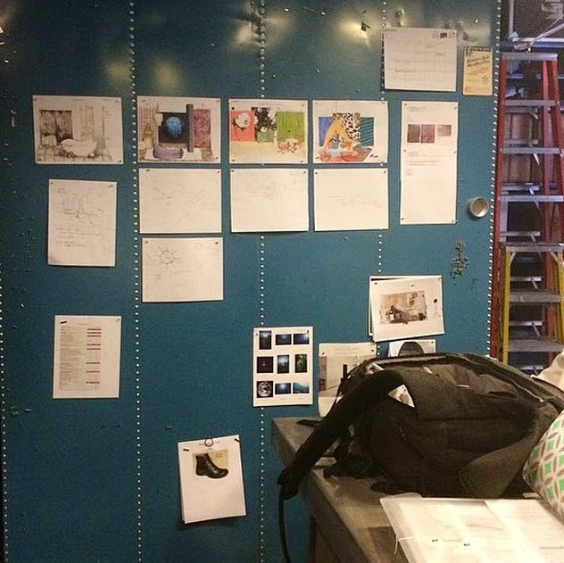
Donna Frasca: Tell me about the buzz at NeoCon. What was that design process like? I’d love to hear more about these design boards and how all the colors and ideas started coming together.
Jackie Jordan: The NeoCon buzz is very positive and people are excited about the future. NeoCon provides the perfect opportunity to unveil Sherwin-Williams annual color forecast to the country’s most influential designers. These professionals are looking for the latest and greatest in interior design, and there has been a lot of buzz around our booth regarding the four palettes for 2015.
In terms of the design process, we look at what is occurring in art, the economy, pop culture, science, nature and global cultures. Each of these influences prompt us to explore color and combine hues in a new way. Once we determine the palettes, we work with expert teams to create visual representations that bring to life the colors and stories behind the forecast.
Donna: I love the excursion into space with VOYAGE. I see you incorporated Expressive Plum SW 6271 in the new Colormix 2015 for this color forecast. This color is very similar to your Color of the Year Exclusive Plum SW 6263. Do find that the color trends from 2014 will translate well into 2015?
Jackie: Absolutely. Trends don’t just come and go – they evolve. Each year we look at drivers through a slightly different lens. For example,in 2015 we have a greater optimism for the future, so colors are trending brighter and more saturated.
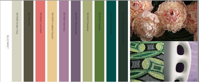
Donna: We can always rely on Mother Nature and her beautiful colors to cheer us up. I see BUOYANT has a very “back to Nature” feel. Are you finding that people want the “back-to-basics” colors in their home? I think we all find a great comfort when we bring the outdoors in our homes and the BUOYANT color forecast represents that well.
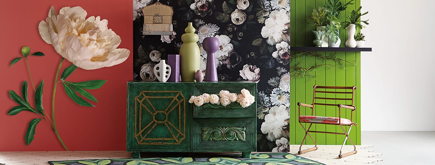
Jackie: We all crave colors of nature. The Buoyant palette incorporates beautiful hues, but also uses neutrals to provide a balance to those floral tones. These colors look great in a bedroom and kitchen, but can be applicable for any outdoor or commercial space as well.
Donna: Now the colors in UNRESTRAINED are very colorful! Do you think this color forecast will be particularly appealing to our younger, youthful generation? I can see these colors a perfect fit for playrooms and exuberant accents in any kids bedroom.
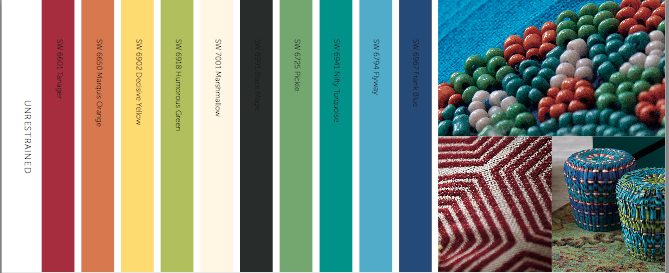
Jackie: This palette is applicable to all generations as it has saturated hues that are modern and contemporary. These colors can be used as accents in any commercial space and lend themselves well to office environments and children’s hospitals. The unrestrained palette also has residential application for kids bedrooms or any contemporary architectural space.
Donna: I know Colormix 2015 has just been released but I’m already seeing a lot of positive buzz about the CHRYSALIS grouping. These colors are just so fantastic and you can see a strong coastal feel echoed in this palette. Don’t you think that this particular color forecast will really compliment the colors that most people have in their homes now which really are the top 10 colors of Sherwin-Williams? I also love how you dip dyed the prop rocks in the CHRYSALIS photo with some of the colors from the forecast. That was very clever!
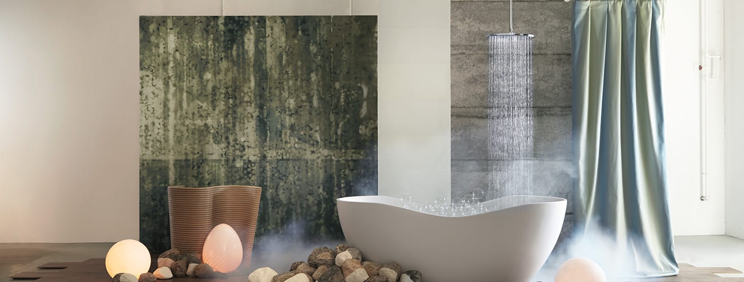
Jackie: Yes, this palette definitely has a coastal feel, but more importantly it has a soothing, calming feel. Its main drivers are people’s desires to unplug from the constant, ever-connected, multi-tasking life. There are a lot of neutrals in this palette, which can be a nice backdrop to the current design in a home. There are also options for a little more color such as Willow Tree (SW 7741) that will compliment the neutrals or accessories in a home. The Chrysalis palette colors also translate well into healthcare spaces with Aqua-Sphere (SW 7613) or Moody Blue (SW 6221).
Jackie, thank you so much for taking us behind the scenes with ColorMix 2015. I’m looking forward to seeing what “Color of the year for 2015” is and I’m guessing Willow Tree SW 7741 which happens to be in the CHRYSALIS color forecast. We’ll see!