Good things sometimes take a while—from painting prep to making dreams real.
More than simply open-the-can-and roll, communication is an important part of the house-painting and color-selecting process. Visualizing is another piece of the process and sometimes we need all the help we can get. Have you ever wished you could see your home painted beautifully, in all its glorious detailed color, before you bought the paint and before the painters arrive ready to roll?

Maybe… “in your dreams.”
Well, so have I.
In fact, over a year ago I got the notion to try to make this happen. One step at a time, Designer Color Palettes was born. OK, so I’ve had the domain name for about 5 years now… just waiting for the right pieces to come together.
It’s like prep for a good paint job.
I wrote a blog post on my own site, a while back, about prep for painting being like meditation and how it requires a lot of patience—and really even the right kind of personality—to do the job right. That’s what developing Designer Color Palettes has been like.

One of my dreams has been the desire to share many more than one paint company’s colors…we now have colors for ten popular paint companies! After all, why limit your customers to colors from just one company?
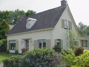
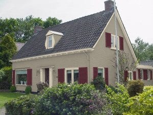
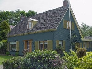
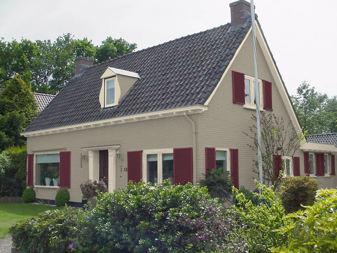
And, as with a good, professional paint job using “physical paint,” selecting areas of a photograph to “virtually paint,” can be frustrating and time-consuming when you want to see more than one generic color area, and have it applied to photos of your own house. So, we’ll do the work, and leave the enjoyment of the results to you.
Using actual pictures of client’s homes, not generic images, was also important to me.
But since most people—myself included—are not professional photographers, I offered some photo tips so you can send us your best possible pictures to work with.
Wanting to see the house “Painted…digitally” with a variety of options for color changes (before the painters come!) was another goal. Why be limited to a three-color palette? Walls, Trim, Door… that’s fine for a starting point. But why stop with the beginning?

What about seeing the details, and making downspouts disappear, and adding interest to a “vanilla” building? I was excited to be able to include these things. In fact, if someone wants to make 50 different colors on one house (not likely) or any other type of building, we can do that!
Now, we’re getting somewhere, I reflected. But still, what about that sign in front of the house? OR, the trees that block the view? Or…landscaping equipment and cars in the driveway when the picture was taken? Now we can get rid of all the physical obstructions without even hiring a contractor first. That’s exciting, too!
Even better, I thought, that I can use this to help on-site clients as well as those who live far away and want long-distance consulting services. But many people want to pick out their own colors at the paint store, and not everyone wants to use a consultant. My goal was to offer a way for people to see what their own color choices would like. Then, if they want some professional help for additional color suggestions at any time, they can add it into the mix.
After all, every visual aid is useful. Not an afterthought, I intentionally added information about digital color views and the importance of testing paint colors—just another example of how your patience will pay off in the long run.
So, what’s the drawback? There’s a form that offers a lot of detailed information so people can define exactly what they need. Which, as it turns out, is not a drawback at all— but it’s a very good thing.


Thank you Barbara, I have enjoyed our conversations and hope our readers/contractors will find this a useful resource.
Thanks for asking me to participate, Chris, I enjoyed the process and our chats. I look forward to reading more on this site.
Great tool Barbara. This is a good step for homeowners when they are making a significant color change on their homes. I often find they have a hard time visualizing the transformation in their minds.
Thank you Chris,
I look forward to sharing the most recent project – not yet completed – a large scale condo complex, exterior. They asked for two color palettes of 5 colors each. One of the color schemes was to use their current colors, plus a couple others; the other scheme was to be a complete departure from what they are used to. This has been the perfect way to show them the two palettes and all the minor tweaks and variations that followed.
That sounds like the perfect use! Let us know how it turns out!