Coral Reef celebrates a time for renewal
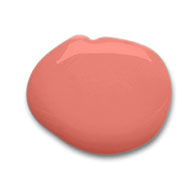
CLEVELAND (November 18, 2014) – Perfectly suited to celebrate a mid-decade year that’s poised for revitalization, Coral Reef (SW 6606) is Sherwin-Williams Color of the Year 2015. The uplifting hue is the perfect blend of pink, orange and red that can be used to liven up any space.
Pulled from the Sherwin-Williams Buoyant palette, Coral Reef is influenced by our botanical fixation and optimistic outlook for the future.
 “Coral Reef embodies the cheerful approach to design that we’re seeing for the coming year. Its unexpected versatility brings life to a range of design aesthetics, whether traditional or contemporary. This carefree color will liven up a client’s space,” said Jackie Jordan, director of color marketing, Sherwin-Williams.
From healthcare facilities to retail spaces and multi-family communities, Coral Reef is a versatile color that can be applied across a variety of residential and commercial spaces. Coral Reef can be used in a dining space within a senior living facility or on the wall of a multi-family game room. It can also be paired with colors such as Baroness (SW 6837) and Paradise (SW 6720) to stimulate senses in an educational setting. This tropical color lends itself well to hospitality settings, especially in warm climates such as Calif., Florida and Hawaii.
Standing out in a vibrant color forecast
Each year, Jordan and other Sherwin-Williams color experts research color influences from around the world to determine the annual color forecast and the Color of the Year. colormix 2015 is comprised of 40 colors grouped into four palettes. In addition to the Buoyant palette in which Coral Reef resides, colormix 2015 includes the Chrysalis, Voyage and Unrestrained color palettes.
Buoyant
“After weathering the recession and finally seeing signs of growth, the Buoyant palette reflects our enthusiasm with colors that evoke big, bright floral designs and inspire consumers. Our spirits echo the optimism following World War II when GIs returned from exotic locales, bringing tropical prints and tiki-inspired looks,” said Jordan.
Chrysalis
As technology rushes ahead, the colors of Chrysalis offer a calm oasis — a place to pause and find balance. The palette’s colors range from off-black to chalky neutrals and dusty blues, for more comfortable interiors. “An influence for Chrysalis is the appreciation of earth’s natural striations,” said Jordan. “Patterns created by the land and sky are driving inspiration for colors found in nature, from agates to stormy skies.”
Voyage
From space tourism to undersea resorts, the sci-fi dreams of past decades are more viable than ever. The Voyage palette looks to these outer limits, featuring hues imagined while emerging from the water into the atmosphere — undersea teal, bright green kelp, light watery blue and deep space purple.
“The colors of Voyage are supernatural and magical. The palette is driven by unusual atmospheric events including a decade-best aurora borealis, keeping our eyes focused on the heavens,” said Jordan. “The palette’s lighter colors create an uplifting space, while its deeper tones combine to add drama.”
Unrestrained
From bold, ethnic-inspired colors and designs to the Bohemian lifestyle, the Unrestrained palette celebrates free-spirited wanderlust. Its saturated primary hues include sunny yellow, lively turquoise and bright blue, as well as black and white. Each can be used for a pop of color, or combined to create a vibrant, energetic space.
“South Africa’s colorful art scene and focus on the 2016 Summer Olympics in Rio de Janeiro have influenced a Carnival-like spirit, inspiring design with a zest for life. The vibrant colors of Unrestrained reflect that aesthetic,” said Jordan.
Color Resources
In addition to the colormix 2015 palettes, professionals can find inspiration with color selection tools from Sherwin-Williams. At swcolor.com, design professionals can view all Sherwin-Williams colors and collections, link to downloadable palettes for use in color rendering software and access the online Color Visualizer.
Designers can also register on myS-W.com and order large-sized color swatches and fan decks.
All Sherwin-Williams color resources can be found at http://www.sherwin-williams.com/architects-specifiers-designers/color/color-tools.
colormix 2015 Colors
| Chrysalis | Voyage | Buoyant | Unrestrained |
The question is what do YOU think of Coral Reef? I’ve been studying color for the home for some time, it’s my job 🙂 Anyway, I’ve been searching for a color that is new, fresh, liked by BOTH men and women and more importantly, not a blue hue. Coral Reef comes really close. I’ve been writing about “Salmon” since 2009 because I think it’s just a great hue to have in the home for so many reasons. Coral Reef is a cute color, one that will be very likable by women and popular in the girls rooms but it still leaves out the men. This is why my suggestion is too add just a tad more yellow to it and call it salmon. Oh well, I guess if I wait another five years it will eventually come out 🙂
Donna, I tend to like the natural earth colors myself, this one reminds me of my grandma’s bathroom, all the tile was this color! I do like seeing the palettes for ideas!
Oh I know what color you’re talking about Chris, that was in my in-laws NY home and it was dreadful! It was a bear trying to come up with a wall color that would look right with “coral reef” tile without going neutral.