SHERWIN-WILLIAMS NAMES ALABASTER 2016 COLOR OF THE YEAR
A flattering, natural white, Alabaster sets the tone for harmony for nearly any space
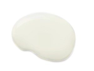
CLEVELAND (Nov. 18, 2015)– Sherwin-Williams announced Alabaster (SW 7008), a hue symbolic of new beginnings, as the 2016 Color of the Year.
ALABASTER SW 7008
“Alabaster represents a straightforward and necessary shift to mindfulness, well-being and an atmosphere that is pure,” said Jackie Jordan, director of color marketing, Sherwin-Williams. “It provides an oasis of calmness, spirituality and ‘less is more’ visual relief. Alabaster is neither stark nor overly warm, but rather an understated and alluring hue of white.”
The color encourages a time to relax and re-examine, at a time when people are faced with excess and clutter. A mindful and rejuvenating atmosphere created by the color is suited for both commercial and residential settings.
Color of the Year
Drawn from Pura Vida, one of the four palettes in Sherwin-Williams colormix 2016, Alabaster represents the prominent use of light, which is a key element for traditional Nordic design. It also pairs nicely with other popular Scandinavian décor influences including sleek lines, copper metallic finishes, marble and wood grain materials.
Public Spaces
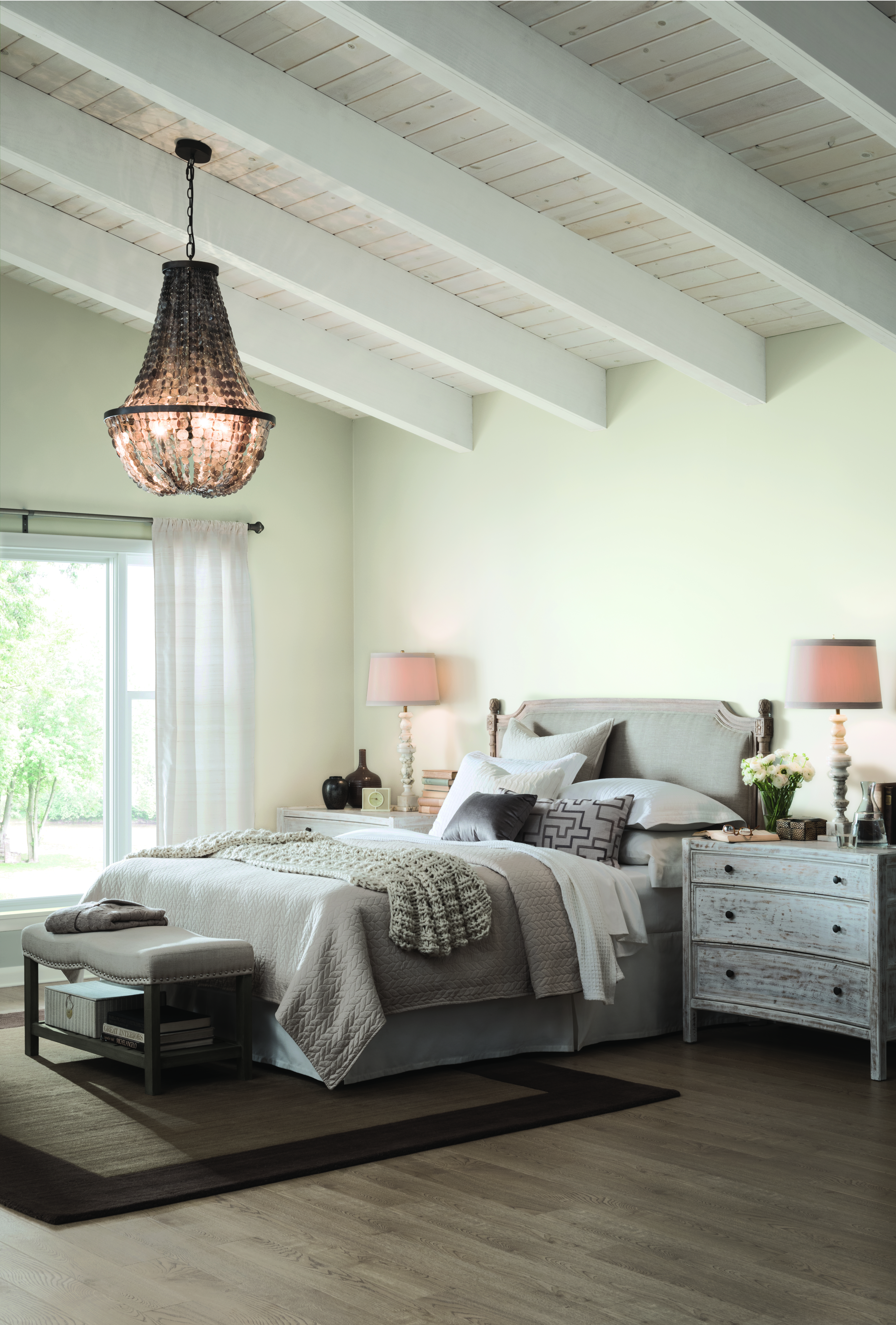
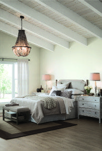
Alabaster’s naturally flattering, barely-there undertones make for an attractive option when selecting a neutral color for spaces where people interact, such as lobbies, restaurants or retail settings. In healthcare spaces or a hotel spa, the color promotes a setting for healing and relaxation. The hue stands alone as a monochromatic statement, or forms a yin and yang harmony with contrasting dark colors, such as Urbane Bronze (SW 7048) or Gray Area (SW 7052).
Comfortable and eclectic, elegant and functional, opposed by shadowy tones or paired with other light blushes and grays, Alabaster is the true neutral to set the tone for 2016.
 Comfortable and eclectic, elegant and functional, opposed by shadowy tones or paired with other light blushes and grays, Alabaster is the true neutral to set the tone for 2016.
One thought on “SHERWIN-WILLIAMS NAMES ALABASTER 2016 COLOR OF THE YEAR”