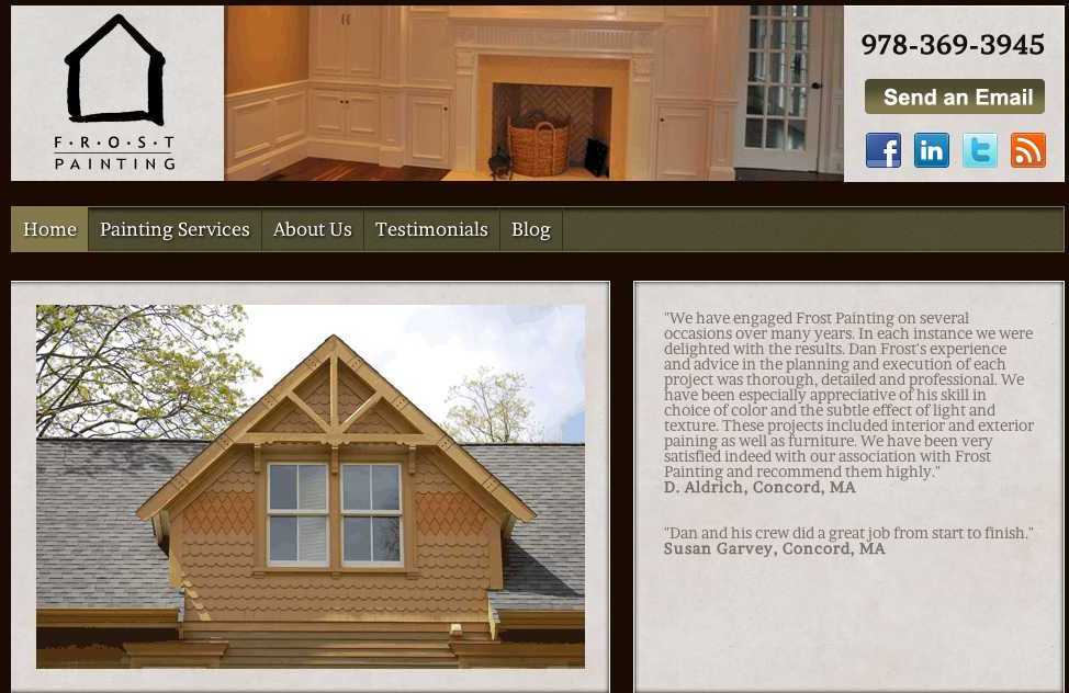
This month we reviewed Frost Painting, Dan Frost was not able to join the hangout due to technical issues. Tess and Darren were still able to offer some valuable insights though, here is a recap:
Home Page
2:15- Darren discussed the slider, logo and the use of Social Media links
The Visual Appeal
7:08- Tess made some good points about the photos and the use of ALT tags and Caption Titles. She noted that the testimonials are great in the slider, but move too fast and made some suggestions. She brought a good point about the customer being able to answer the question, “Are you the right painter for me?”. This can be shown by sharing your USP, features/benefits and call to action.
The SEO
12:30-It was noted there little SEO benefit on the home page. The services topics could be expanded to be separate pages lined to home page. Footer Logos
14:00-There were some images in the footer area that we discussed that may be better placed elsewhere. There was also a discussion of the use of the web developers links being added. Keeping Contact info simple was discussed as well. If you are going to add logos to organizations, they should be linked.
Contact Info
17:20-Contact information should be consistent and simple, just give the best way to contact you, not every number!
Expanding your Services
19:50- As was previously pointed out, each service you offer should have it’s own page and be correctly optimized to rank independently. Your site should be more than a brochure, it must convert!
Why you need to hire a pro!
25:00-Creating content is tough. Professionals like Darren and Tess are well versed in what customers look for when they are shopping for a service. They can provide the methods and content that will help set you apart from the competition.
About Us Page
27:58- Good content, but it needs to be formatted properly. It needs at least 14 point font, subheads and paragraphs. Darren made some good points about titles. This is where the local citations like BBB, PDCA, and Social Media buttons should be. There should be a strong call to action to tell the customer where to go next or what to do.
Testimonials
39:25-Add credibility with customer name and locations. Use the best testimonials to highlight services, don’t ever create your own! Tess talked about the “hidden nuggets” and how to use them.
The Blog
46:00-Same comments about breaking up text and using headings. We discovered some great content written by Dan that is buried in the blog. These should be cross linked in the main text of the website.
Photos
51:47- We found some beautiful projects on his Facebook Page. These need to be properly tagged and on the website.
We hope you found some useful information here, we appreciate Darren and Tess!
Want your site reviewed?
If you would like a website review, please fill out the form here. You must be available to participate in a Google Hangout, the next one will be September 19th 2012 at 8:00 Eastern Time.

