How will Google’s new search engine changes impact your website’s search ranking, traffic and leads?
Have you noticed your website’s search engine traffic decline the past couple of weeks? On April 21st, Google updated their search algorithm by adding ‘mobile-friendliness’ to the factors it uses to rank websites on its mobile search engine results. The update impacts mobile search results by bumping up and prioritizing webpages that are ‘mobile-friendly’ and dropping down and penalizing webpages that aren’t. A key reason for the update is the rapidly growing number of mobile searches. In fact, as of May 2015, Google confirmed that for the first time there were more searches taken place on mobile devices than on computers in 10 countries including the US. This update aligns with Google’s strategy of creating the best search experience possible.
 Google defines mobile-friendliness with several key components:
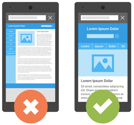 Google defines mobile-friendliness with several key components:
- Viewport Configuration – Triggered when Google detects your page does not specify a viewport, or specifies a viewport that does not adapt to different devices
- Font Legibility – Triggered when Google detects that page text is too small to be legible
- Use of Incompatible Plug-ins – Triggered when Google detects the use of plug-ins on your page
- Content to Viewport – Triggered when Google detects that the page content does not fit horizontally within the specified viewport size, thus forcing the user to pan horizontally to view all the content
- Size and Proximity of Links – Triggered when Google detects that certain tap targets (e.g., buttons, links, or form fields) may be too small or too close together for a user to easily tap on a touch screen
Companies can use Google’s mobile-friendly test to determine the mobile-friendliness of their site: https://www.google.com/webmasters/tools/mobile-friendly/ .
If a site isn’t mobile-friendly, there are four primary solutions, each with their own benefits and cost.
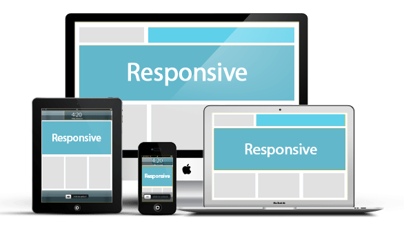
- Build a new site that has “responsive web design” which means that the page uses the same URL and code whether the user is on a desktop computer, tablet, or mobile phone and the display automatically adjusts or “responds” according to the screen size. This is Google’s recommended long-term solution and from a branding perspective, is the best option as your site will be consistent across all platforms. However, this alternative comes with the cost of creating a new site.
- Build a mobile version of your current website. While this is one way to bring your site into compliance, it requires you to maintain two separate websites and splits your domain strength which will negatively impact your search ranking. This is not a recommended option.
- Convert your existing website to mobile-friendly with custom programming. This option also may have significant cost (often may be more expensive than creating a new website) depending on how outdated your site is and whether it includes Flash or e-commerce platforms.
- Use a mobile plug-in on your existing website. The most popular website content management systems including WordPress offer add-on solutions to make your site mobile-friendly without needing two separate websites. This is a great way to become compliant quickly without significant cost. Although, with this option websites typically don’t maintain the exact same look and feel between mobile and desktop.
A recent case study: Jacobsen Brothers Painting, http://jacobsenbros.com/, a leading residential and commercial painting company in Boulder, Colorado, realized they weren’t offering a mobile-friendly experience to website visitors.
 After working with DK Marketing Group, http://www.dkmarketinggroup.com/, a leading online marketing firm that specializes on painters and contractors, to evaluate improvement options, Jacobsen Brothers Painting decided to install a mobile plug-in on their WordPress site.
“We like our website and didn’t see the value in investing to create a new site at this time. Although we realize that in the future we will need a responsive website, working with DK Marketing Group to implement the plug-in enabled us to become mobile-friendly and we’ve been very happy with the results.”
Mark Jacobsen, President, Jacobsen Brothers Painting.
In summary, as with any investment, companies should consider the return.
With this new update, it may make sense to investigate how many of your website visitors are using mobile devices and evaluate whether it makes sense to go after this market segment. Companies may also want to research the bounce rate (% of visitors who quickly leave the site without taking any action) as this could indicate an opportunity for improving your mobile experience. Perhaps also consider analyzing your local competitor’s mobile pages to see if this could be differentiator for you in driving leads. Regardless of your decision, keep in mind that mobile searches are only going to continue increasing and as a result, Google will continue prioritizing the mobile experience.
To learn more about mobile-friendly websites, visit Google’s Mobile Guide, or contact DK Marketing Group, info@dkmarketinggroup.com.
Great post! Thank you for sharing this info. 🙂
Thanks Mike! Please feel free to reach out to me at dan@dkmarketinggroup.com or (216) 678-9403 if there’s anything we can do to help with your site.
I found it very helpful! for my company http://www.brownheatingandcoolinginc.com/
Thanks Christian! Please let me know if you have any additional questions regarding being mobile friendly or SEO in general. My contact: dan@dkmarketinggroup.com or (216) 678-9403
Great article. Mobil can you go!
Thanks April!
Thanks Dan for a great article, experts like you make BP a great resource for our readers, we appreciate your contribution!
Thanks Dan for this nice article.
We appreciate your contribution!