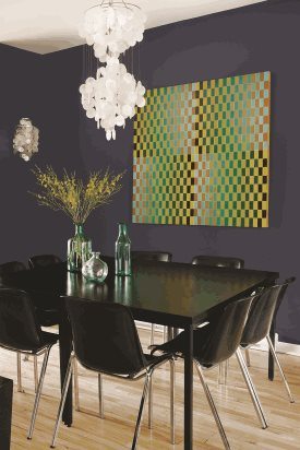
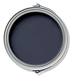
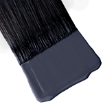
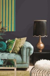
 We recently reached out to PPG Paints, to see if they had any tips they could give us on selecting paint colors for your home and the process on how they selected their most recent Color of the Year, Black Flame.
Dee Schlotter, Senior Color Marketing Manager, was kind enough to answer our questions.
Now, we realize selecting something as big as the Color of the Year as a pretty daunting task. We asked Dee to describe a little bit about what is involved in the process.
In February 2017, PPG had more than 20 of their global color stylists gather together, this one being the eighth consecutive PPG Global Color Forecast workshop. During the three-day meeting, this group discussed societal and regional trends, as well as overarching consumer insights to determine the following year’s color trends forecast, as well as the 2018 Color of the Year. Because of its ability to represent a variety of different events, consumer personalities and feelings, Black Flame was chosen as the PPG PAINTS® 2018 Color of the Year on the final day of the event. Dee went on to say that they forecast this color to resonate with their customers across multiple industries because of its versatility and relatability to current consumer cravings. Black Flame represents new beginnings, comfort, solace and strength.
Dee Schlotter, Senior Color Marketing Manager
There most certainly had to be other colors in the running for this prestigious title, so we asked what they were. Dee gave nothing away though, saying:
“Determining one single color is difficult, and sometimes the final color choice is heavily debated. We did have another color bubble to the surface that was popular in home décor, but it didn’t resonate with our other themes and trending materials as much as Black Flame.”
Still curious about the process, we asked if the workshop used recent analytical data trends in actual purchases or if it was more of a “feel” for the direction they see color and design trends headed in their selection process. Dee made sure to point out that PPG knows that they influence trends as much as trends influence them, and their forecasts represent and connect to consumer feelings and preferences.
They use a wide variety of sources and societal influences to gather their information.
“PPG also knows that it’s not simply about one color, but rather a combination of trending colors to create an overarching, and all-encompassing color story that resonates with our broad range of customers”
Having named Black Flame their Color of the Year right before 2018, we asked how it’s been received by customers so far. We wanted to know if naming a color showed a spike in purchases or if it was already a pretty popular color.
“Bringing a color to the surface from the more than 2,000 colors in the PPG Paints palette always generates interest and favorability. In 2017, tinting of the Color of the Year increased by 300 percent from the previous year”
She also went on to explain that the most interesting place that they have seen this color used is on interior doors. From closets, to room doors, to interior doors that lead to the exterior, Black Flame provides notice and weight. Because it’s a super modern, yet classic color, this color can also be seen on the exterior of many homes as well.
Not only does the workshop pick the color of the year, but they also work on the color trends and themes of the year as well. The 2018 PPG Global Color Trends palettes has 4 themes to it, to which they’ve given them their own names – The Retreater, The Dream Weaver, The Commoner, and The Brave. The PPG brand develops this palette each year to help inform design and color choices for professional customers, from professional painters to designers and architects.
 If you’re any bit as curious as we are, we had to know how colors got their names and what the process looked like. We imagine it had to be pretty fun. Dee agreed that it was a fun process for them! She went on to explain that their best inspiration often comes from the input of others. They’ve had a few interactive social media threads, where they’ve posted colors that sparked conversations, which gave some interesting responses and some new ideas. Dee even went to her son’s elementary school a few years ago to get some ideas from the kids there, as they often have no filters and sometimes come up with the most unique names. PPG even holds internal naming contests for its employees. Another resource Dee sighted was nature books and magazines as they usually include color references.
Lastly, we asked what advice they would give to a homeowner trying to find the color they will love for their upcoming paint project. Dee knows that colors are personal for each homeowner, but had some basic suggestions to help make the process easier. The first thing she recommended is to consider the flooring, fabrics and window treatments, as well as if they plan to change any of them. Then, selecting a complementary tone can be chosen from the other colors in the room or the home. They should choose several paint swatches that will coordinate or complement the colors within decor items. Dee recommends holding swatches next to furniture, flooring, and window treatments for a better visual of how the paint will appear against these items, instead of up against the wall, for a better understanding of how it will look in the space. Once they’ve picked a few colors, they should paint a swatch on the wall, so the homeowner can see the color against different lighting throughout the day and evening.
 Textbook Painting is based out of Lakewood, OH. They service the greater Cleveland area for all interior and exterior painting, power washing, and deck staining. If you’d like to read the complete interview with Dee Schlotter, head over to their blog at Textbook Painting.
Editors note:Photos provided by PPG


 In February 2017, PPG had more than 20 of their global color stylists gather together, this one being the eighth consecutive PPG Global Color Forecast workshop. During the three-day meeting, this group discussed societal and regional trends, as well as overarching consumer insights to determine the following year’s color trends forecast, as well as the 2018 Color of the Year. Because of its ability to represent a variety of different events, consumer personalities and feelings, Black Flame was chosen as the
  “Determining one single color is difficult, and sometimes the final color choice is heavily debated. We did have another color bubble to the surface that was popular in home décor, but it didn’t resonate with our other themes and trending materials as much as Black Flame.”
 “PPG also knows that it’s not simply about one color, but rather a combination of trending colors to create an overarching, and all-encompassing color story that resonates with our broad range of customers”
It provided practical advice on choosing the right shades and how different colors can impact the mood of a room. The expert tips on color coordination and lighting considerations were particularly helpful for my home renovation project.