“Color is my passion” says Jackie Jordan, Sherwin-Williams Color maven
I’m inspired by new and fascinating color combinations, reflecting design trends from around the world. And for 25 years, I’ve been helping people bring color into their homes and commercial spaces through colorful paint. So one can understand why this is the most exciting time of year for me: Sherwin-Williams has released its annual Colormix™ palettes.
While developing colormix™ 2014, we were influenced by trends in fashion, science, nature, art and photography and global traditions. We carefully crafted these paint palettes – along with our numerous color selection tools – to help professionals guide clients through the color selection process, enhancing an already valuable service. This year’s palettes are as varied as their influences, and include Reasoned, Diaphanous, Curiosity and Intrinsic.
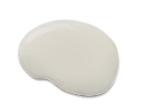
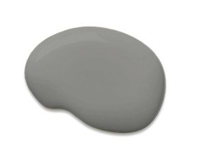
 Our Reasoned palette was inspired by mathematics, so it is rooted in black, white and tones of gray, representing shadows, negative space and tone-on-tone layering. Colors like Tricorn Black (SW 6258) and Agreeable Gray (SW 7029) celebrate the quantifiable world’s impact on design, illustrated by the use of geometry and 3-D printing, to create patterns and shapes in all forms. I love this palette for a home office, study or library, or even a bedroom or kitchen. For added design interest, I suggest layering two or more colors, like Crushed Ice (SW 7647) and Classic French Gray (SW 0077).
The Diaphanous palette, on the other hand, embodies the very essence of balance, simplicity and elegance. I find the Diaphanous colors to be light and delicate, suggesting serenity and escape. In this palette, the overconsumption in our lives gives way to minimalism and a quiet reality. It evokes silk, chiffon, feathers, natural wool, rose gold, barely-there patterns and soft florals. These influences appear in the form of colors like Fleur De Sel (SW 7666), Malted Milk (SW 6057) and Balanced Beige (SW 7037). I see these colors in a bedroom, nursery, living room or bathroom. Two hues, Steamed Milk (SW 7554) and Sandbank (SW 6052) are the perfect focus of such a room.
 Mad science meets fantasy in our Curiosity palette. It reminds me that what one person may see as strange and unique, another may see as beautiful. The color combinations were driven by science and geology, with nature at the most molecular level becoming a resource for patterns, textures and colors such as Show Stopper (SW 7588) and Quixotic Plum (SW 6265). Mined minerals, metals and raw gems also draw out this palette, which includes Library Pewter (SW 0038) and Relic Bronze (SW 6132). I think of it as avant-garde, experiential, dark and exotic. Colors such as Antiquarian Brown (SW 0045) and Exclusive Plum (SW 6263) are perfect for a library, den or a romantic bedroom.
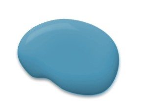
 The Intrinsic palette is a little Bohemian with plenty of color. World events, such as the Winter Olympic Games in Russia, are driving new appreciation of folkloric costumes, patterns and styles of the country, inspiring colors such as Ablaze (SW 6870) and Ceremonial Gold (SW 6382). I find this palette embraces and preserves tradition, culture and design, while bringing in new influences. The colors reflect both cultural and individual traditions, and embrace family and heritage. I love combinations like Capri (SW 6788) and Sawdust (SW 6158), which celebrate this effect in a family room or kitchen.
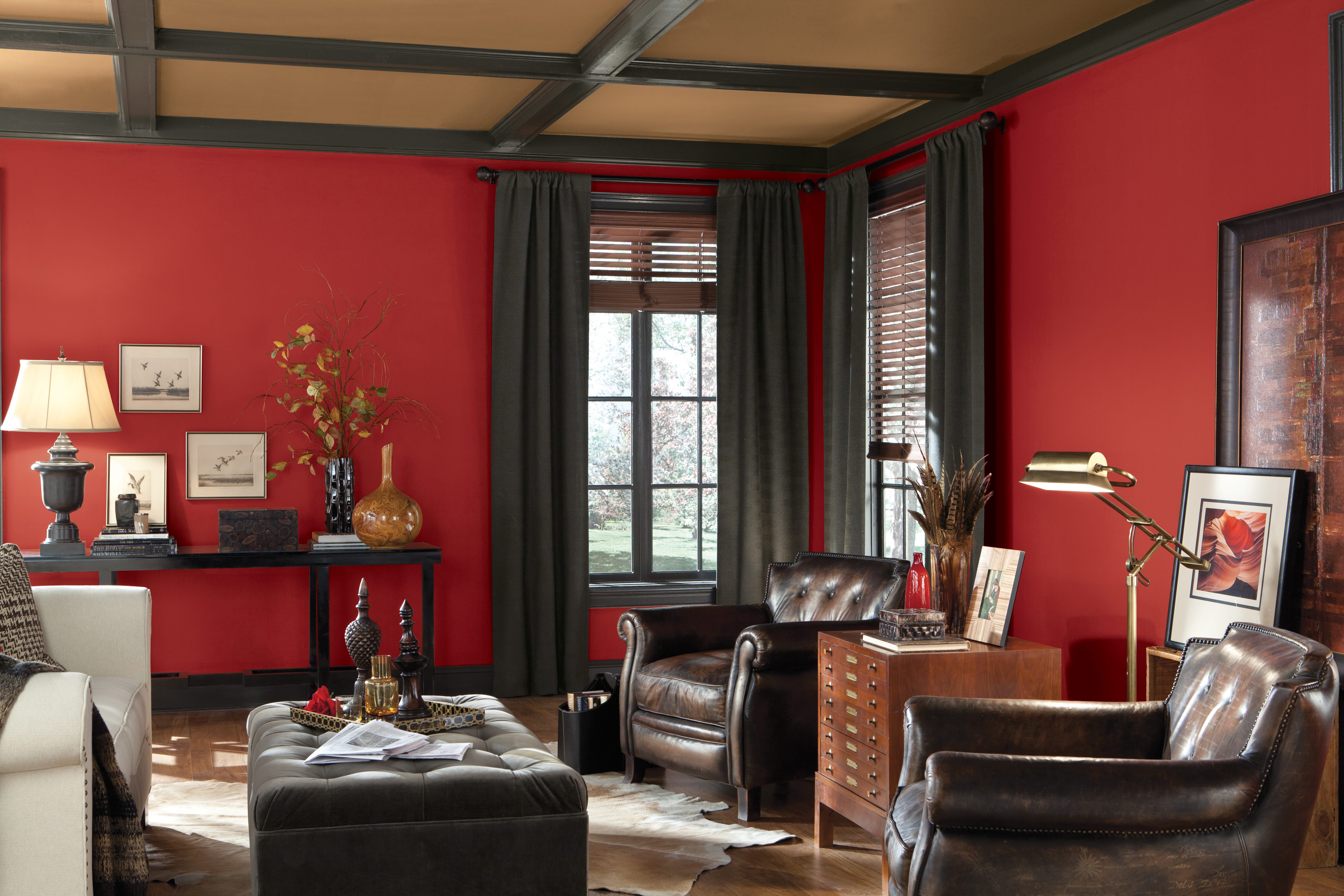
To help clients envision these colors in a room, I use the Sherwin-Williams Color Visualizer. It’s an online tool that brings paint colors to life in a new and exciting way. Color Visualizer shows what paint colors look like on walls, trim or a home exterior – before the paint is applied. You can customize scenes with more than 1,500 Sherwin-Williams colors, by either uploading your image or using one of dozens of images in the tool. And it’s easy to use, thanks to its drag-and-drop method to “paint” color into an image.


If I layer the crushed ice and classic French, do I just paint one coat of each? I’m assuming start with the darker color?