Q: Are you about to make decisions about paint color?
Q: Are you about to recommend paint colors for a client?
Q: How can you make high quality color test samples to help your clients make color decisions?
You’re a painting professional who has just been asked for the Thousandth time…
“how will this color look on my wall?”
Of course you may have even seen the specified color in many other settings over the years—or, perhaps you’ve never seen it yourself in “real life.” Do you have time to test a lot of color swatches for your clients?
Whether you are doing this yourself or perhaps even suggesting that the homeowner (or other client) do it and let you know what they want to use (and some people will actually want to do this), I’d like to share a few tips that you can recommend, or even use yourself if they are new to you. It’s not “rocket science,” we all know that.
Colors are not always the same in different conditions
I recommend starting with the premise that color looks different in all types of lighting and of course throughout the day—and evening—on different surfaces. Color changes in corners, also, as it intensifies where two walls of the same color meet, and it changes in other ways depending on the actual lighting and also when two walls or surfaces (ie: wall and ceiling) of differing colors meet.
It’s the angle that does it – whether the typical 90 degrees or something else, as in a vaulted ceiling, and the reflection of light causes the colors to affect each other.
A few suggestions to create realistic samples
- Make the paint test on a moveable and repositionable surface. Something that can be affixed temporarily to any wall, ceiling, or even floor (when you are painting a floor). Note: do not use your blue tape on the edges of this! Tape the back side only.
- Make the colored surfaces in proportion to each other, for example: Trim colors will usually be narrower than the wall color surfaces.
- Be sure the surface you paint the test on is primed, or at least under-painted with a color similar to what you’re testing. For example, you can of course use poster board but since it’s paper, it must be oil-primed so it does not warp. Personally I like the flat-finish, fast drying low odor products for this. Note: I’ve typically prepared up to 20 or so poster boards with this type of oil primer, to have ready to go in advance–and easy to use at a moment’s notice–when preparing color tests for clients.
- Roll on 2 coats of your finish (test) color, making the application as close to what you intend to do on the final surface. Use a roller with similar pile to what you plan to use on the job.
- Use a stable surface with a texture similar to the wall or surface to be painted. IF the target surface is textured, it’s worth it to make a replica since color reacts so differently with the light falling on textured or smooth surfaces.
- Be sure to do the test with the same finish you’ll be using on the actual surface (Flat? Eggshell? Semi-or-high-gloss?)
- Label your sample cards and cut a nice, smooth-edged one about 8”x8” to leave with the client for their own ‘shopping’ purposes. I find that people appreciate this especially when they are looking at window treatments and furnishings.
OK, so what about materials?
I mentioned using wood, (smooth and primed, of course), poster board and foam core (oil prime first), and you can use other substrates like gator board, or drywall (also prime).
But there is also a really easy solution, one that I personally really like to use and always recommend to my clients who want to do the testing themselves: Small Wall. It’s a great surface, prepared for paint (aka No Priming Needed), a 1’x1’ size (2 in a pack), has a re-positionable adhesive strip on on the back, and can be reused, re-painted. You can even cut it with a solid paper cutter, to make smaller pieces, and hole-punch if that’s how you keep color records. Check out My Small Wall to order, also available in packs of 50 at Sherwin Williams.
Interior or exterior, the same process applies.
For exterior work you might want to have some siding pieces available that are at least very similar to the client’s house if not the exact same thing. Doing more than just one strip (minimum 4 to 6 strips high, of clapboard style) will give a more accurate view of what the shadows will do at various times of day. Remember to make trim samples also, in the same widths as the actual trim and casings or other details.
So, you might ask, why go to all this trouble, anyway?
The main reason is: Minimize confusion, make the color choices easy, and be professional. Stripes and color patches on the walls look messy and are visually confusing. You can’t see the specified colors next to each other on a large enough surface because there is just too much going on and the existing colors will inform the appearance of the tested colors. Heidi talks about putting “smiles on customers faces” using these here.
Have you used these methods?
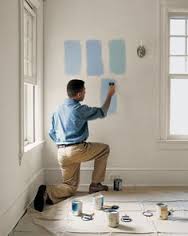
 Hang a white sheet, use white paper, or paint white primer background. This is a start but there are still too many colors in one area and you can’t move them around the room at all.
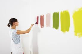
 Patches are confusing – use one color at a time. This is a useless waste of time, money and emotion.
 Place your reviewed color in corners, next to walls, next to ceiling if possible, next to floor or baseboards, next to doorway to see adjacent rooms with the proposed new color you’re reviewing. In this example they are using a large test area and have applied the color in adjacent walls meeting in a corner, but then it’s complicated by using the swatches of other colors, even if they are variations on a theme.
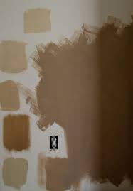
This is another ineffective test, using colors that are too close together, not painted solidly so they look streaky, and not masked from the background. It’s hard to tell what the new colors actually are!
Mask the wall with white, make a large, rolled paint sample, using a roller is best, to get the most solid coverage (Yes, 2 coats) and no streaks. The point is to replicate the actual color appearance of the final surface.Doing this on a separate card or large poster board will give you an idea of the actual color.
Compare these samples on the wall. Can you tell the difference?
There is one more thing you can offer, that some painters have even used as their palette application guidelines. That is to create a digital rendition of what the house will look like with the various colors on the different parts of the house. You can use color tools like these to paint “digitally” or hire a professional like me.
That’s a great way to show a couple of color options in an overall visual. But that’s another story!


I found this blog very helpful in color sample placement. Thanks!
Very helpful topic. I’ll definitely be sharing.